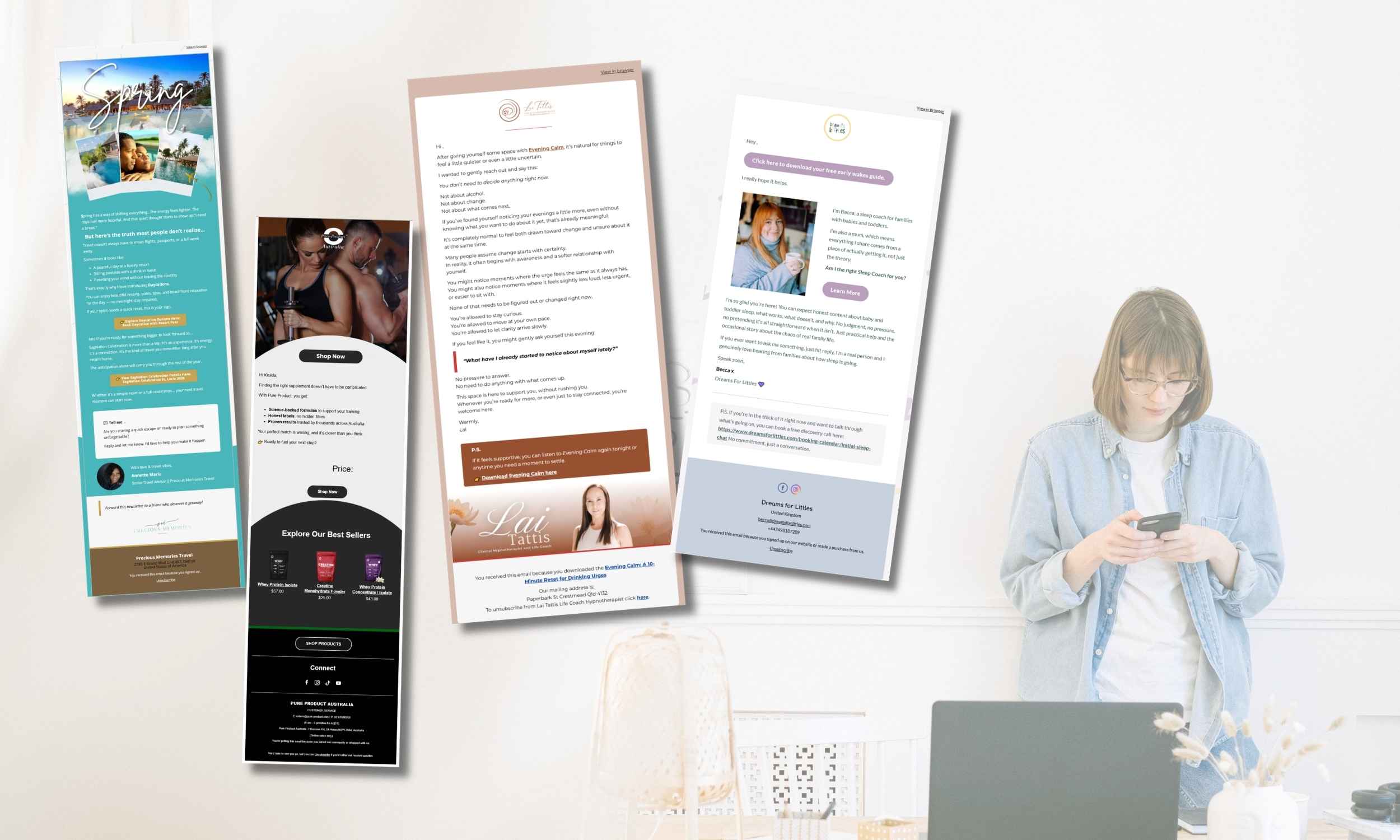
If you’ve been wondering how to make emails look pretty without hiring a designer or spending hours inside your email platform, you’re not alone. Most entrepreneurs think they need complicated layouts, advanced design skills, or expensive templates. However, the truth is much simpler: learning how to make emails look pretty is more about clarity and consistency than creativity.
In this guide, I’ll walk you step by step through exactly how to make emails look pretty using simple layout tricks, brand basics, spacing rules, and formatting techniques that work beautifully in MailerLite, Klaviyo, or any email platform.
Let’s simplify this.
Why Pretty Emails Matter (But Not for the Reason You Think)
When people search for how to make emails look pretty, they usually want something visually impressive. However, in email marketing, “pretty” doesn’t mean complex.
Instead, pretty emails are:
Easy to read
Clean and balanced
On-brand
Clear in structure
Not overwhelming
Most importantly, pretty emails improve:
Engagement
Click rates
Trust
Professional appearance
And that’s what actually grows your business.
Step 1: Start With a Clean Structure
Before colors, fonts, or images, structure matters most.
If you truly want to learn how to make emails look pretty, start here:
Use this simple structure:
Short opening sentence
One medium paragraph
Line break
Bullet points (if needed)
Clear CTA
Generous spacing
White space is powerful. In fact, too many people make their emails feel heavy simply because they don’t use enough spacing.
So instead of writing long blocks, break content into smaller sections.
This instantly makes your emails look prettier.
Step 2: Use Only 1–2 Brand Colors
Another mistake people make when trying to learn how to make emails look pretty is using too many colors.
Instead:
Choose 1 main brand color
Choose 1 secondary color
Keep everything else neutral
For example:
Main color → Buttons
Secondary color → Links or highlights
Neutral → Body text
Consistency always looks more professional than variety.
Step 3: Stick to 1–2 Fonts Maximum
Email platforms already limit font choices for compatibility reasons. That’s actually good.
If you’re serious about how to make emails look pretty, follow this rule:
One font for body text
One font for headings
That’s it.
Too many fonts make emails look messy and amateur.
Advertisment
Step 4: Use Visual Hierarchy
Visual hierarchy means guiding the reader’s eye naturally.
You can do this by:
Using bold text strategically
Adding short subheadings
Using bullet points
Increasing heading size
Leaving breathing space between sections
For example:
Instead of:
Here are some tips for improving your design and making your email look professional and easier to read which can help with engagement and conversions.
Break it into:
Here are 3 ways to improve your email design:
Simplify your layout
Reduce colors
Add spacing
Much cleaner. Much prettier.
Step 5: Don’t Overuse Images
This may surprise you.
Many beginners think pretty emails need lots of graphics. However, text-based emails often convert better.
Use images:
For headers
For product visuals
For freebie previews
But don’t overload the email.
If your goal is how to make emails look pretty, remember:
Simple + breathable = elegant.
Step 6: Create a Reusable Template
One of the smartest things you can do when learning how to make emails look pretty is to create one base template.
Inside MailerLite or Klaviyo:
Design one layout
Save it as a template
Reuse it every time
This ensures:
Consistency
Speed
Brand recognition
And consistency is what actually creates that “professional” look.
Step 7: Make Buttons Clean and Clear
Your CTA button should:
Use your main brand color
Have enough padding
Use simple wording
Good examples:
“Get the Guide”
“Download Now”
“See the Details”
“Book a Call”
Bad examples:
Long, complicated sentences
Multiple buttons in one section
If you want to know how to make emails look pretty, remember that clarity always wins.
Step 8: Optimize for Mobile
Over 60% of emails are opened on phones.
So:
Use larger font sizes
Avoid long horizontal sections
Keep buttons full-width
Test before sending
Pretty on desktop but messy on mobile? That’s not pretty.
Always test both.
Step 9: Keep Your Footer Simple
A messy footer can ruin everything.
Your footer should include:
Your name
Your brand
Social links
Unsubscribe link
No clutter.
Clean ending = clean impression.
Step 10: Remember, Pretty Means Professional, Not Decorative
At the end of the day, how to make emails look pretty isn’t about decoration.
It’s about:
Clean spacing
Consistency
Clear structure
Simple branding
Focused message
If your email feels calm, easy to read, and aligned with your brand, it’s already pretty.
Final Thoughts
You don’t need to be a designer to know how to make emails look pretty. You just need structure, consistency, and simplicity.
If you apply:
Clean layout
Limited colors
Clear formatting
Mobile optimization
Your emails will instantly look more professional.
And remember, clarity always converts better than complexity.
Want Help Designing Your Email Templates?
If you’d rather have beautifully structured templates created for you, ready to use in MailerLite or Klaviyo, I can help.
But first…