If you have ever wondered how to make emails look pretty without spending hours in design tools or hiring a developer, you are not alone. Most small business owners and freelancers send emails that technically work, but visually, they fall flat. The good news? You do not need to be a designer to send stunning, professional emails. You just need the right platform, a few smart principles, and a simple system.
In this post, you will learn how to make emails look pretty using MailerLite, from layout and fonts to colour, spacing, and CTAs that actually get clicked. Whether you are brand new to email marketing or you have been sending newsletters for a while but feel like something is missing visually, this guide is for you.
Why Email Design Actually Matters
Before diving into the how, it is worth understanding why email design matters in the first place. Many business owners focus exclusively on subject lines and copy, and while those are important, the visual experience is what keeps people reading past the first few lines.
Research consistently shows that people scan emails before they read them. That means your layout, font size, and use of white space all determine whether your message gets absorbed or immediately archived. In short, a well-designed email builds trust, reinforces your brand, and makes it easier for your reader to take action.
Furthermore, a pretty email is not just about aesthetics. It is about clarity. When your email is clean and easy to follow, your call-to-action stands out, your offer is understood, and your click-through rate improves as a result.
Start With the Right Email Platform
The first step to making your emails look professional is choosing a platform that does not limit your design options. MailerLite is one of the best tools for small businesses and freelancers because it comes with a drag-and-drop editor, pre-built blocks, and a clean, intuitive interface, even for beginners.
Additionally, MailerLite gives you full control over colours, fonts, button styles, and layout without needing to touch a single line of code. If you are currently on a platform that feels clunky or restrictive, switching to MailerLite could be the single biggest upgrade you make this year.
Related read: Best Email Platform for Small Business
The Core Elements of a Pretty Email
Now, let us get into the practical side. Making emails look pretty comes down to mastering a handful of key design elements. Once you understand these, you will be able to apply them to every email you send.
1. Layout and Structure
The layout is the skeleton of your email. A single-column layout almost always wins on mobile, and since the majority of emails are opened on a phone, this matters a lot. Use a clear hierarchy: headline at the top, supporting text in the middle, and a call-to-action at the bottom.
In MailerLite, you can build this structure with content blocks. Stick to one main idea per section, and do not be afraid of white space. Breathing room between elements makes your email feel polished rather than cluttered.
2. Fonts and Typography
Typography is one of the most overlooked parts of email design. However, it makes a massive difference. Choose one or two fonts and stick with them consistently. In MailerLite, sans-serif fonts like Arial, Lato, or Open Sans work beautifully because they render well across all email clients.
Use a larger font size for your headline (at least 22–28px) and a comfortable 16px for body text. Avoid long paragraphs — instead, break your copy into short sections of two to three sentences. This keeps readers engaged and makes your email feel approachable rather than overwhelming.
3. Colour and Brand Consistency
Your email should look like it belongs to your brand. That means using your brand colours for buttons, headlines, and accent elements. In MailerLite, you can save your brand colours and access them anytime inside the editor, no need to look up HEX codes every time.
Additionally, keep your background clean. A white or very light grey background allows your content to breathe. Use colour strategically to draw attention to what matters most, rather than colouring everything and creating visual noise.
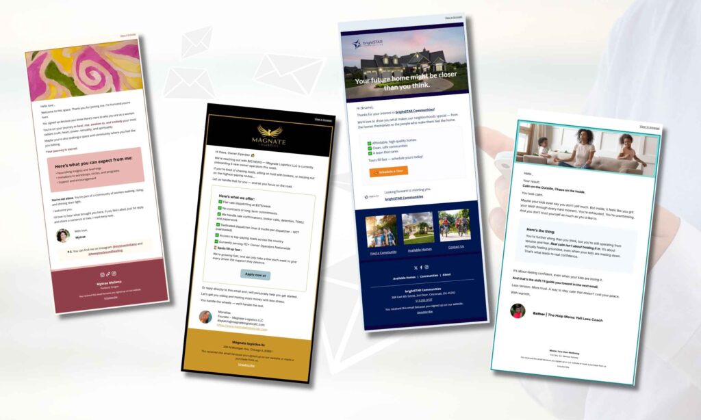
4. Images and Visual Breaks
A well-placed image can transform the feel of an email completely. However, more images does not always mean better design. In fact, one strong, relevant image used intentionally tends to perform far better than a gallery of visuals that slow load time and overwhelm the reader.
If you design graphics in Canva, you are already ahead. You can create branded email banners, section dividers, or product highlight images that match your colour palette perfectly. Export them at the right dimensions, typically 600px wide, and upload them directly into MailerLite.
5. Buttons and Calls-to-Action
Your call-to-action button is arguably the most important design element in your email. It needs to stand out clearly from everything around it. Use a contrasting colour for your button, one that is part of your brand palette but different enough to catch the eye.
In MailerLite, you can fully customise button colours, border radius, padding, and text. Make your button text specific and action-oriented. Instead of a generic ‘Click Here’, try ‘Download Your Free Guide’, ‘Book Your Free Call’, or ‘Start Today’. Specific language converts better.
Step-by-Step: How to Design a Pretty Email in MailerLite
Now that you understand the elements, here is a simple step-by-step process you can follow every time you create a new campaign in MailerLite.
- Log in to MailerLite and click ‘Create Campaign’. Choose a regular campaign and give it an internal name.
- Select a template or start from scratch. For a clean, branded email, starting from a blank template often gives you the most control.
- Add a header block first. This is where your logo sits. Keep it centred and not too large, around 150–200px height is usually ideal.
- Add your hero section. This is either a bold image or a strong headline with a short subheading. This is what your reader sees first, so it needs to hook them immediately.
- Build your content sections. Use short text blocks, a relevant image or icon, and keep each section focused on a single point.
- Add your CTA button. Make it bold, make it clear, and give it enough padding so it is easy to tap on mobile.
- Add a footer. Include your logo, a short tagline, social links, and your unsubscribe link. MailerLite adds the unsubscribe automatically.
- Preview on mobile before sending. MailerLite has a built-in mobile preview; always check it before hitting send.
Common Mistakes That Make Emails Look Unprofessional
Even with the best intentions, some design habits can undermine the look of your emails. Consequently, it is worth knowing what to avoid just as much as what to do.
- Too many fonts: Stick to two at most. Mixing three or more fonts creates visual chaos.
- Walls of text: Long, unbroken paragraphs are exhausting to read. Break it up.
- Inconsistent colours: If your button is a different colour in every email, readers do not build visual recognition of your brand.
- No white space: Cramming content together feels overwhelming. Let your layout breathe.
- Unreadable text on dark backgrounds: If you use a dark background, make sure your text colour contrasts sharply; white or very light shades only.
- Missing alt text on images: If images do not load, your email should still make sense. Add descriptive alt text to every image.
How to Save Time With Email Templates in MailerLite
One of the smartest things you can do once you have designed an email you love is to save it as a template. In MailerLite, you can do this directly from the editor, and it means every future email starts from a polished, on-brand foundation rather than a blank page.
Moreover, saving a template dramatically reduces the time it takes to put together each campaign. Instead of rebuilding your layout from scratch every week, you simply update the text, swap the image, and adjust the CTA. This is especially valuable if you send a weekly newsletter, because consistency in design also builds familiarity and trust with your audience over time.
If you are setting up automation sequences, you can apply the same template logic across every email in your flow. That way, every touchpoint, from your welcome email to your sales sequence, feels cohesive and intentional.
Making Your Emails Pretty Is a System, Not a One-Off Task
Here is something many people overlook: beautiful emails do not happen by accident. They happen when you build a repeatable system. That means having your brand colours saved, your logo uploaded, your template ready, and your Canva graphics sized correctly before you even start writing.
When you invest a little time upfront to set up your MailerLite account properly, with your branding in place, your automation flows connected, and your templates built, every email you send from that point forward becomes faster and more consistent.
This is exactly the kind of setup work I help clients with. Whether you are starting from scratch or cleaning up an account that has grown messy over time, having a properly configured MailerLite account is the foundation for emails that not only look beautiful but actually convert.
Quick Reference: Design Checklist for Every Email
Before you hit send, run through this checklist to make sure your email looks its best:
- Single-column layout with clear visual hierarchy
- Brand fonts and consistent font sizes
- Brand colours applied to headlines and CTA button
- One strong, relevant image (600px wide)
- Short paragraphs with breathing room between sections
- CTA button with contrasting colour and specific text
- Mobile preview checked and approved
- Footer with logo, tagline, and unsubscribe link
- Alt text added to all images
Final Thoughts
Learning how to make emails look pretty does not require expensive software, a design background, or hours of trial and error. With MailerLite and a few consistent design principles, you can send emails that feel professional, on-brand, and genuinely enjoyable to read, every single time.
The most important thing is to start. Pick one email, apply these principles, and notice the difference. Then build from there, save your template, and let your system do the heavy lifting.
Want someone to check your MailerLite setup for you?
I offer a MailerLite Setup Review; I go through your account and send you a private video within 5 business days telling you exactly what’s working, what’s broken, and what to fix. One-time, $67
If you would like help setting up your MailerLite account, designing your email template, or getting your automation flows in place, I offer done-for-you MailerLite setup services tailored for small business owners and freelancers. Feel free to reach, I would love to help you build an email presence that looks as good as your business deserves.
You can also download my Effortless Setup Starter Kit, where I share practical steps for building email systems that run smoothly in the background.